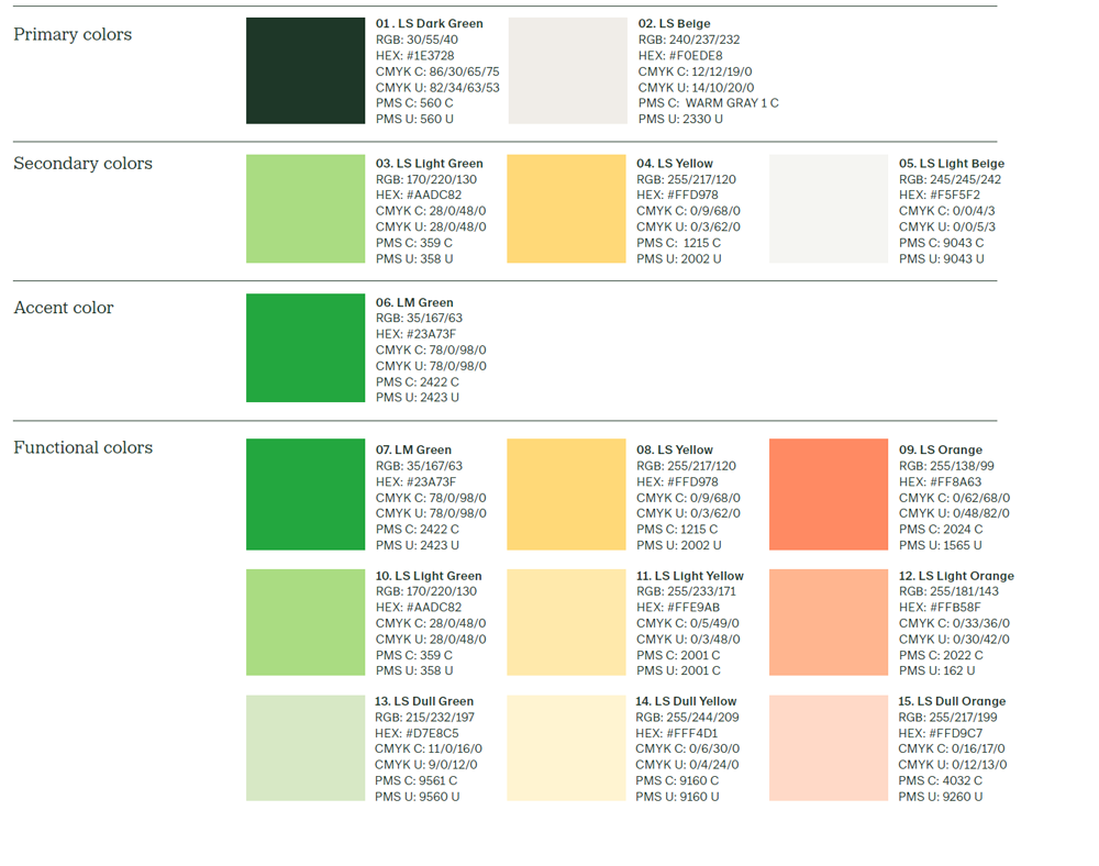
01. LS Dark Green
Used as the primary color for text and the logotype. It conveys stability and depth, anchoring the identity in professionalism and trust. However, it should be sparingly used as a background color, as it risks dominating the overall composition.
02. LS Beige
Acts as the foundational backdrop within the visual system. It serves as the main background color, offering a neutral yet warm surface for other colors to rest against. In combination with the secondary colors, it forms the basis for patterns and compositions.
03. LS Light Green
A toned-down green colour with a clear visual connection to Lantmännen and the other greens in the palette.
04. LS Yellow
A warm, inviting, and energizing accent color. It brings variation to the palette – particularly in patterns and decorative details – and subtly evokes flavor and liveliness.
05. LS Light Beige
A lighter version of the primary background color. It’s used to create soft, subtle patterns when layered with dark beige, adding nuance and texture to surfaces.
06. LM Green
A discreet accent color that reinforces the link to Lantmännen. It is used in small-scale graphic details to subtly strengthen the identity.
07–15. Functional colors
A set of colors specifically reserved for use in charts, tables, and data visualizations. These ensure clarity, differentiation, and visual consistency in information-heavy contexts.