Design elements
Here are the appropriate design elements and how these can be designed to be specific to Lantmännen and our visual identity.
Here are the appropriate design elements and how these can be designed to be specific to Lantmännen and our visual identity.
Lines in a layout provide a perception of order and establish and create clear distances and relationships between different objects. Our inspiration comes from magazines and periodicals whose design is made to attract the reader.
Lines also help us to provide stability to the layout. Lines can be used to delineate an area, or to divide areas and at the same time keep groups of text or graphic objects together.
We use solid and dashed lines with rounded finish. In the example to the right, two lines are used in the same arrangement, since it may be appropriate to combine a solid one and a dashed one.
Start with a 1pt line thickness for publications in normal format. Very large or very small formats require the thickness to be adjusted.
Start with a 1pt line thickness for publications in normal format. Very large or very small formats require the thickness to be adjusted.
The picture shows:
Here we show examples of how lines can be used together with text and graphic objects.
Here are examples of how lines can be used together with text and graphic objects horizontally.
Use the element "speech bubble" for a quotation or for additional communication such as for example a tip or a prompt.
The speech bubble is a line with a rounded corner and point. The point is always on the right. Adjust the width to the text’s width. In this example the line thickness is 1.5 pt
Tables can be designed and varied in many different ways. Use colour for a vibrant impression.
It is recommended that Lantmannen Sans is used which is specially adapted to be easily read in numerical settings.
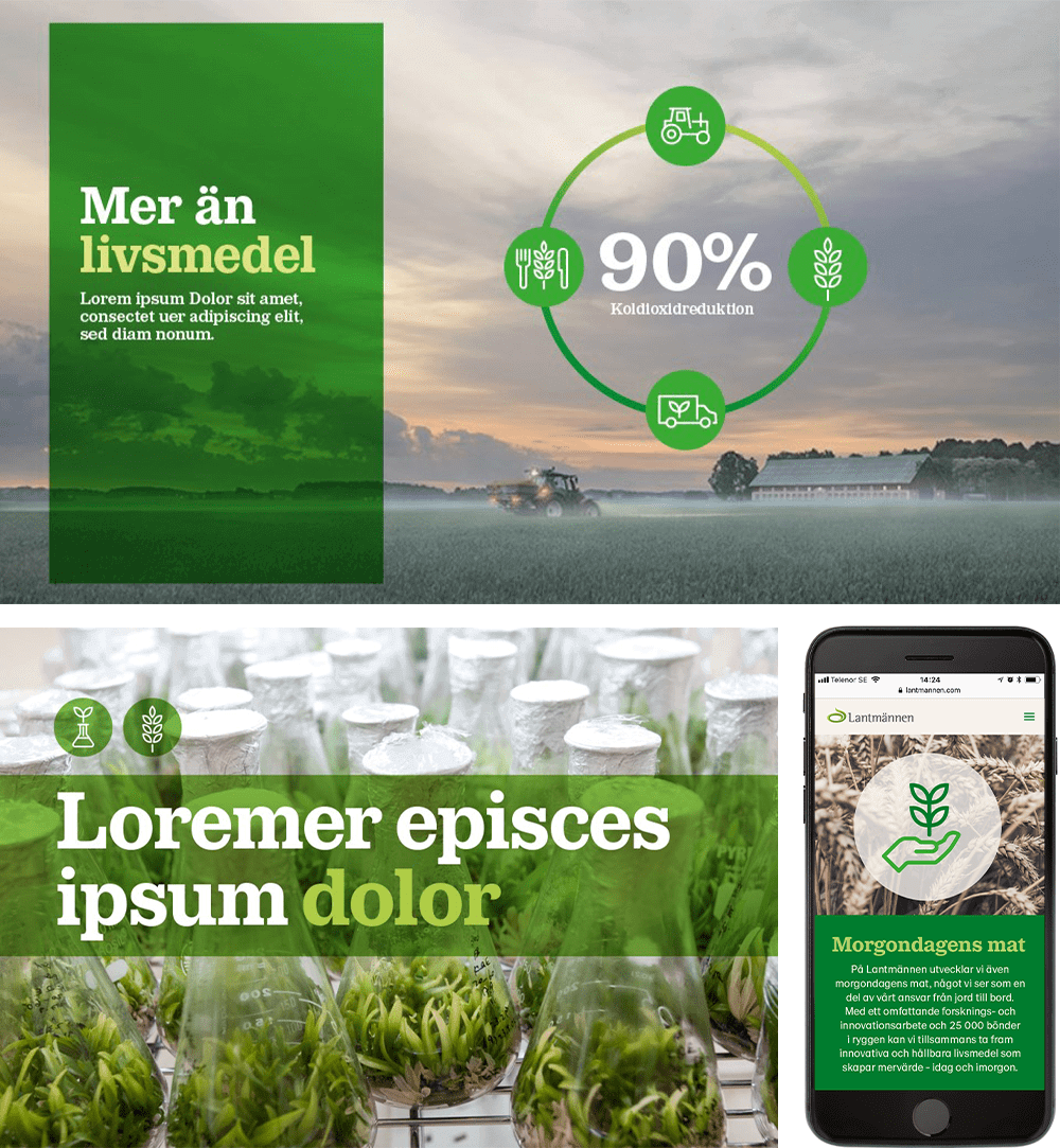
The inclusion of round shapes injects dynamism into a mainly straight layout. Circles can for example, contain an image, pictogram or infographic.
By using colour with transparency, we can insert larger green areas in a layout without making it seem flat. This also contributes to the impression of a multilayer layout - “layers on layers” - that we wish to achieve.
Transparency in Photoshop
Transparency is created by multiplying the solid colour areas in the image. Choose a green colour that makes the image stand out and at the same time ensure a contrast with texts.
You can also use a white solid colour area. Instead of multiplying the solid area against an image, lower the opacity property value; adapt this value for the image being used.


