Download color paletts

Download and install our color scheme for easier and more secure handling of the color codes.

Lantmannen_CMYK.zip Lantmannen_Hex.zip Lantmannen_Pantone_coated.zip Lantmannen_Pantone_uncoated.zip Lantmannen_RGB.zip

Show all

The Lantmännen colour scale

Green is our colour. Our colour scale is sourced from where we come from, from the fields and their changing shades. The impression of Lantmännen must be green, preferably in different shades. We start with our primary green colour and add lighter or darker shades as required.

The Lantmännen color scale

Together with logotypes and typefaces the colour scale is what creates recognition. Lantmännen uses a green colour scale. Green stands for many positive values such as natural, sensitivity and harmony and green gives a sense of a sprouting development.

The green colour scale
All of Lantmännen’s communication is based on the green colour scale, which consists of a green primary colour and five supporting identity colours.
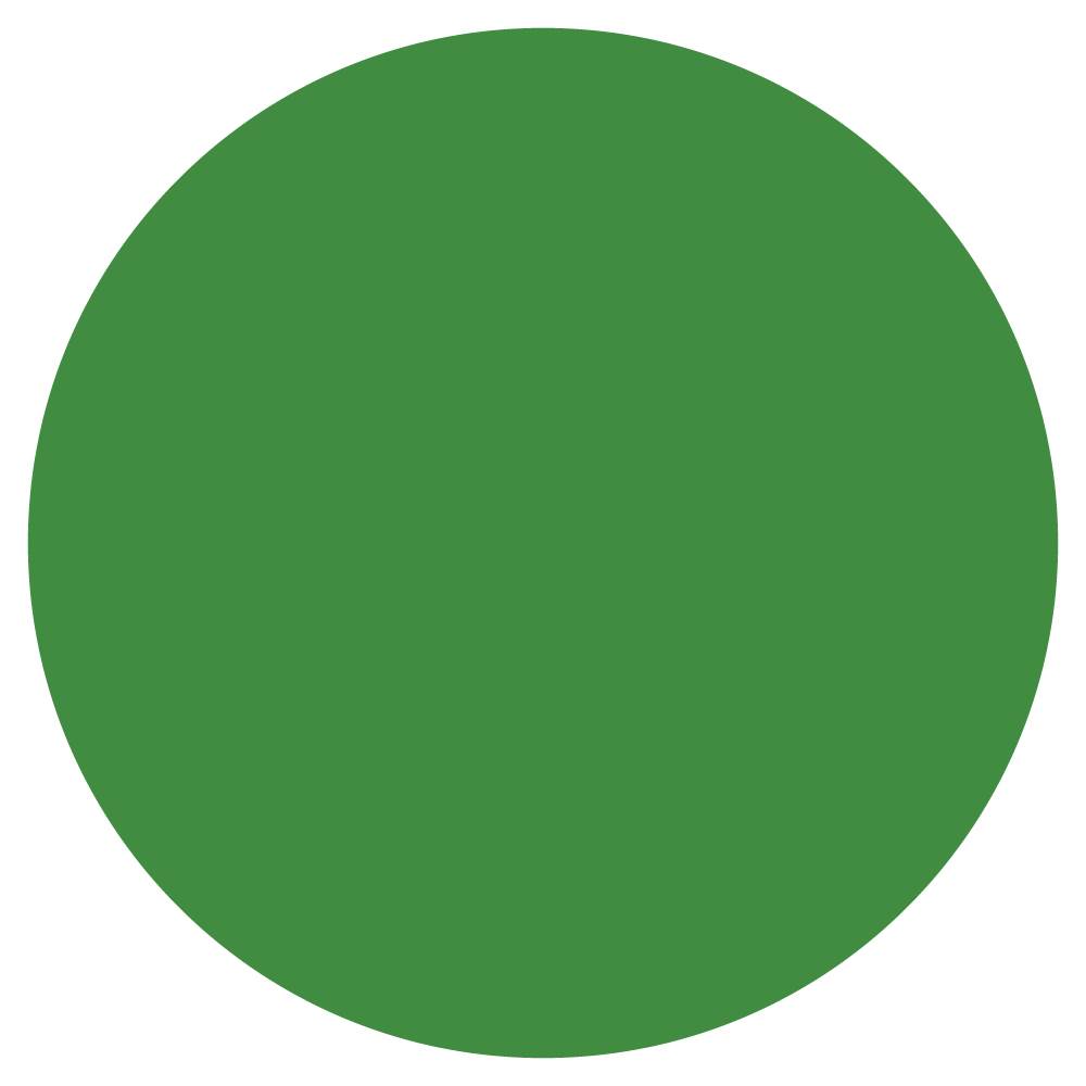
Function colours
The green colour scale is complemented by three colours with specific functions.

  • A blue colour kick that is used e.g. to accentuate and highlight a graphic element. It should not be used as a background colour or overpower the green in a layout.
  • A sand coloured background colour for e.g. solid colour areas.
  • A grey text colour that can replace 100% black text where the latter is perceived as contrasting too strongly with the background.

Colours for information graphics
This colour scale may only be used for information graphics, not in layouts as primary color.

Primär Identitetsfärg

CMYK
78/0/98/0

PANTONE
2422 C, 2423 U

RGB
35/167/63

HEX
23a73f

Supporting identity color 1

CMYK
23/0/57/0

PANTONE
2274 C&U

RGB
215/225/140

HEX
D7E18C

Supporting identity color 2

CMYK
40/0/70/0

PANTONE
366 C&U

RGB
180/205/115

HEX
B4CD73

Supportive identity color 3

CMYK
58/0/82/0

PANTONE
360 C, 3561 U

RGB
145/185/90

HEX
91B95A

Supportive identity color 4

CMYK
90/0/100/15

PANTONE
2258 C, 2426 U

RGB
65/140/65

HEX
418C41

Supporting identity color 5

CMYK
100/0/100/35

PANTONE
3500 C&U

RGB
30/110/55

HEX
1E6E37

Our colors in print

Here you see examples of our colors in print. Please read more about the colors we use in the statistics in the example in the section Color for information graphics.

Contrasts between our colors

We create the green and budding impression by combining the green colors with each other. Make sure a good contrast and readability by choosing color pairs at least two steps apart in the color scale.

Read more about how to create and use text tiles in the section "Applications" and look at "Design elements".

Transparency

By using colour with transparency, we can insert larger green areas in a layout without making it seem flat. This also contributes to an impression of a multilayer layout - “layers on layers”.

Transparency in Photoshop
Transparency is created by multiplying the solid colour areas in the image. Choose a green colour that makes the image stand out and at the same time ensures a contrast with texts.

You can also use a white solid colour area. Instead of multiplying the solid area against an image, lower the opacity property value: adapt this value for the image being used.

Use of colors in product photo shoot

For studio photo shoot we have a guideline how to add the green color in a suitable way. Read more about it here