Example photo shoot brief
Here are examples of images and how the guidelines can be used for best results.
Here are examples of images and how the guidelines can be used for best results.
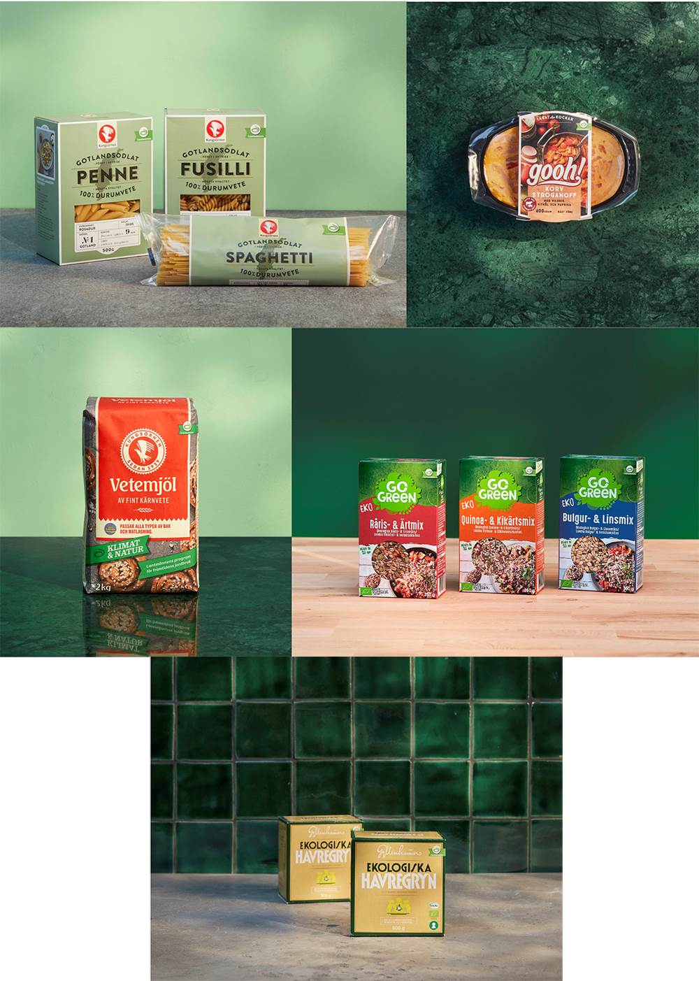
The purpose of these images is to showcase products from Lantmännen's brands. It is then important to find a way to visually elevate Lantmännen without drawing attention away from the products in the picture.
Therefore, both the shadows and the green color are strongly present here.
Uniform variation
To give a calm, uniform but at the same time a varied expression, we work with all the different backgrounds and materials that have been produced. The materials must be able to be mixed and matched freely. No props are used here - only packaging in picture.
Perspective
Straight from the front or straight from the top to get a consistent expression and for the packaging to have maximum exposure for itself. It is the packaging that is the heroes in the picture.
To the top perspective: Choose a surface in a green material
or one of the green shades as a background.
When the everyday and simple is a big part of the campaign idea, we show the product in a picture, without packaging, to get as close to the people's everyday life as possible.
Here, the green color is present while the shadow play has had to take up less space, as it would mess too much with text, logo and other elements (see below).
Perspective
The purpose of these images is to be on the website and represent different areas where we talk about Good food.
In these pictures, we therefore want to highlight "Good food from Lantmännen" and inspire with wonderful pictures of dishes and ingredients. The perspective is from above mainly to fit in with the image formats available on the website but also to give the food and ingredients maximum focus.
Set
We are on a neutral kitchen counter as the food and ingredients are the main focus in these pictures (A green surface would look "campaign" here, and not authentic). A few simple props are used to enhance the feeling of cooking and everyday life. It should feel simple, but above all look good.
Shadows & light
We work with a natural light that gives long shadows. The idea is to get the feeling that the light is shining in from a window to feel the presence from nature.
The green color is an important detail and creates recognition here too, it is present in the form of green raw materials.
Studio landscape built with the new green complementary colors.
At Climate & Nature, the guarantor is the sender, but we show it with the logo to show that the substrate color has sufficient contrast to the sprout (our symbol).