Typography
An important component of our identity that creates recognition in the communication in all channels.
An important component of our identity that creates recognition in the communication in all channels.
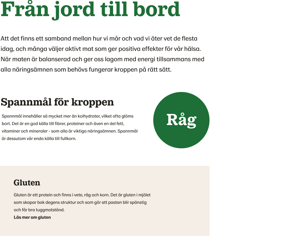
We consistently use the following fonts:
Lantmännen Serif
is the typographical basis of our visual identity. Used mainly for headers because readability is affected when written in smaller degrees.
Lantmännen Sans
As a supplement to the Lantmannen Serif, Lantmannen Sans is used in other contexts, for example in bread texts and pictorial texts. Lantmännen Sans is best used for texts in the lower grades and for interactive text such as links.
Main headings
Headings (H1) must be identity-creating and are written in Lantmännen Serif Bold, and are welcome to be used and written in large letters. Mainly use our darkest green, color no. 5 or put it in white if it is to be in a picture. Avoid colors other than green, gray and white.
Other headings and preambles
We avoid using the green color in subheadings and introductions. We choose to use our green color on fewer devices to appear better - to main headings and links. Color is Charcoal.
Body text
For all body text and smaller texts, we work with Lantmännen Sans to make the readability on screen as good as possible. On lantmännen.se, the body text is set to 18/28 px in desktop. Color is Charcoal.
Interactive text
Texts in links, forms and other interactive places look best in Lantmännen Sans.

