Offices and buildings - an important part of our identity
Our offices are among the most important rooms where we meet our customers and partners. Our visitors should meet ONE Lantmännen, no matter whether they see us in Copenhagen, Malmö, Helsinki or Stockholm.

Feeling and tone
The environment that our guests walk into must reflect our operations and show the identity of our brand. We also need to convey a special feeling and provide our guests with a real experience.
Our tone of voice, ‘Engaging’, ‘Insightful’ and ‘Authentic’, summarises the feeling we want to create.
Thinking small means thinking big
Small details can make a major impression, as long as we retain the overall impression. We use natural materials and colours to communicate our world and our roots.
It is normally better to be refined and simple, but sometimes we can make major changes to a room if we know that it reflects our tone of voice and our brand.
Remember that we will have to live with what we do for a long time and it will affect us well into the future; so do not be afraid of asking for internal or external help or advice.
Similarity gives scope for variation
We have quite a lot of freedom within the frameworks we have in place to reflect one Lantmännen. If we are going to enjoy this kind of freedom, we always need to have something that ties everything together and creates recognition: a common thread.
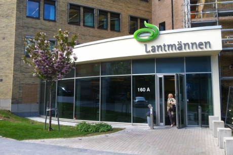
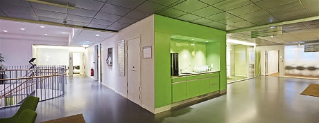
For example, our head office has a meeting area on each floor which are all identical, with the same equipment and colours. By having the same space on each floor, we can use more freedom when decorating the rest of the floor. The most important thing to remember is that you need to convey the feeling of working at the same company, no matter which floor you are on.
See more examples at Interior.

Inspiration instead of direction
This section of the manual explains what you have to think about before you make any changes, both large and small, to your office, and what we took into consideration when building our head office in Stockholm. The examples are for guidance and inspiration, not an exact template for what we should do.
This is what we do:
-
We use natural materials and colours when choosing our furniture and decor.
-
We use small details to send the right signals.
-
We make sure that our furniture and decor speak the same language as our brand.
-
We look at the overall picture even when making small changes.
-
We take people into consideration when planning any redevelopment work.
This is what we do not do:
-
We do not use colours and materials that do not reflect our identity.
-
We do not take chances – we ask for help if we are not sure.
-
We do not rush decisions about furniture and decor/redevelopment. We have to live with the results for a long time.
-
We do not use the manual as a template for Offices and buildings – but as a tool for inspiration
-
We do not design for an interior design magazine, we design for people to thrive.
