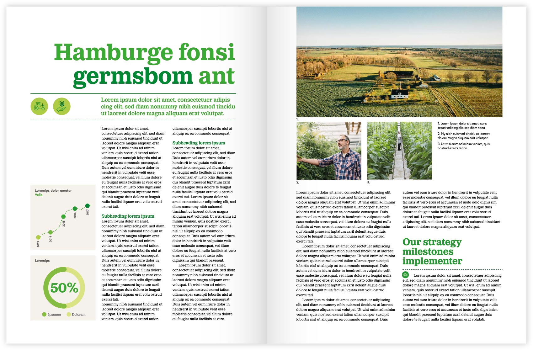
If you want to accentuate individual words and sentences, use italics or the blue kick colour.
Headings
In headings Lantmannen Bold is used.
Big headings give impression and create identity. Use short headings.
Based on the following settings:
Line spacing 95%
Letter spacing: 0
Kerning: Optical
Intermediate heading/introduction
Intermediate headers and introductions are set in Lantmannen Medium.
Based on the following settings:
Line spacing 115%
Letter spacing: 0
Kerning: Optical
Body text
Body text is set in Lantmannen Regular. Columns are aligned to the left with as little punctuation as possible.
Based on the following settings:
Line spacing 120%
Letter spacing: +5
Kerning: Metric


