Examples of how design can be handled in publications

With different design examples, we want to show how the identity can be handled graphically.

The examples are to be inspired by. It is possible to combine our graphical building blocks in different ways to achieve the same result; a more innovative and future-oriented company.
Publications - general tips

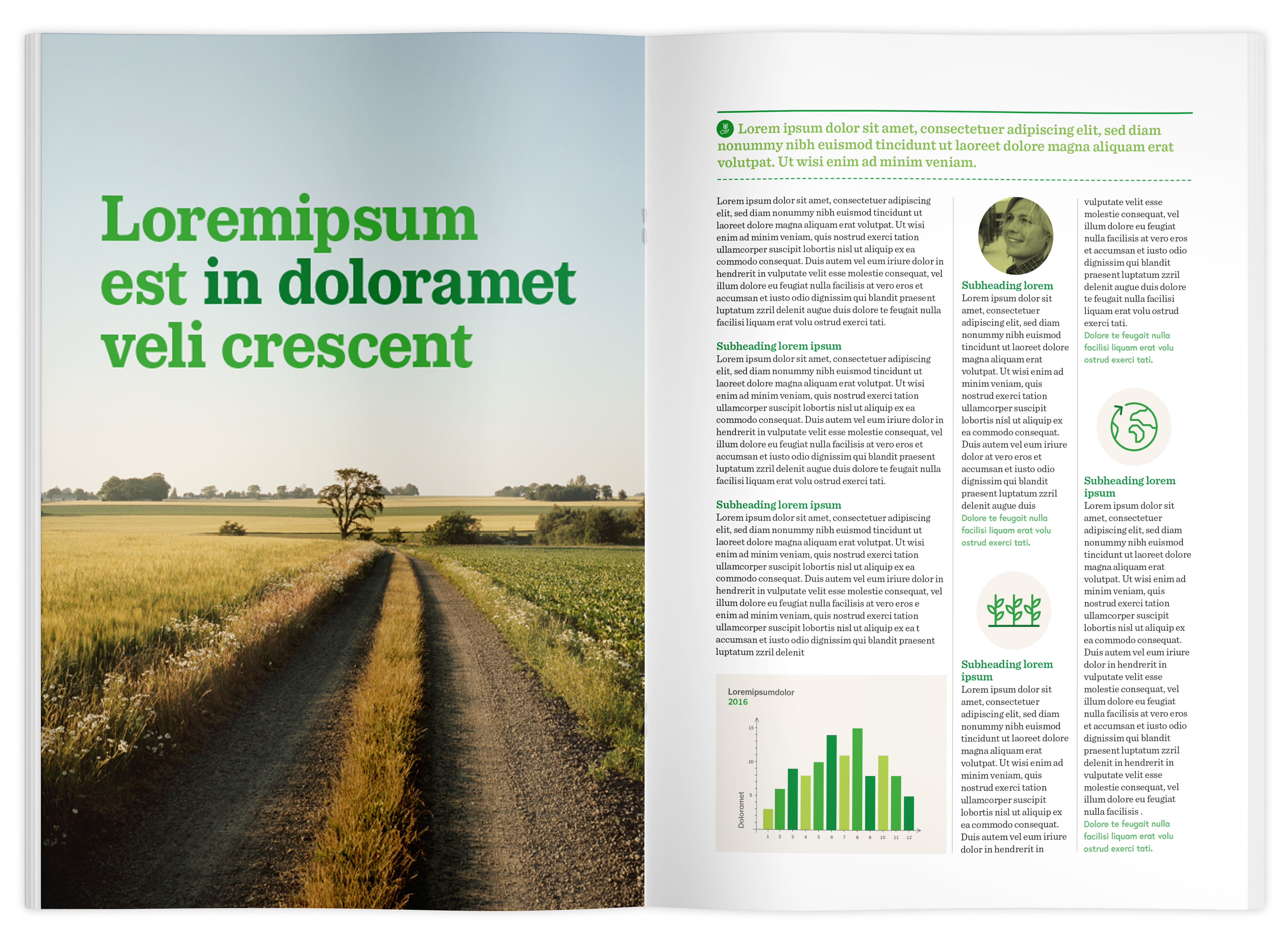
  • Feel free to use large drop-out images. Balance with white or lighter areas.

  • Work with the entire green palette, starting from the primary color.

  • Headings should be large and can be two-colored.

  • Pictograms are well suited as vignette illustrations and can illustrate the subject in a text.

  • Utilize transparency in objects for a "layer on layer" effect.

Publications - column width

  • Varied gap width gives life and dynamics

  • A narrow column width is suitable for short notices.

  • Image or pictogram can be used, as an illustration to the text.

Publications - setting area

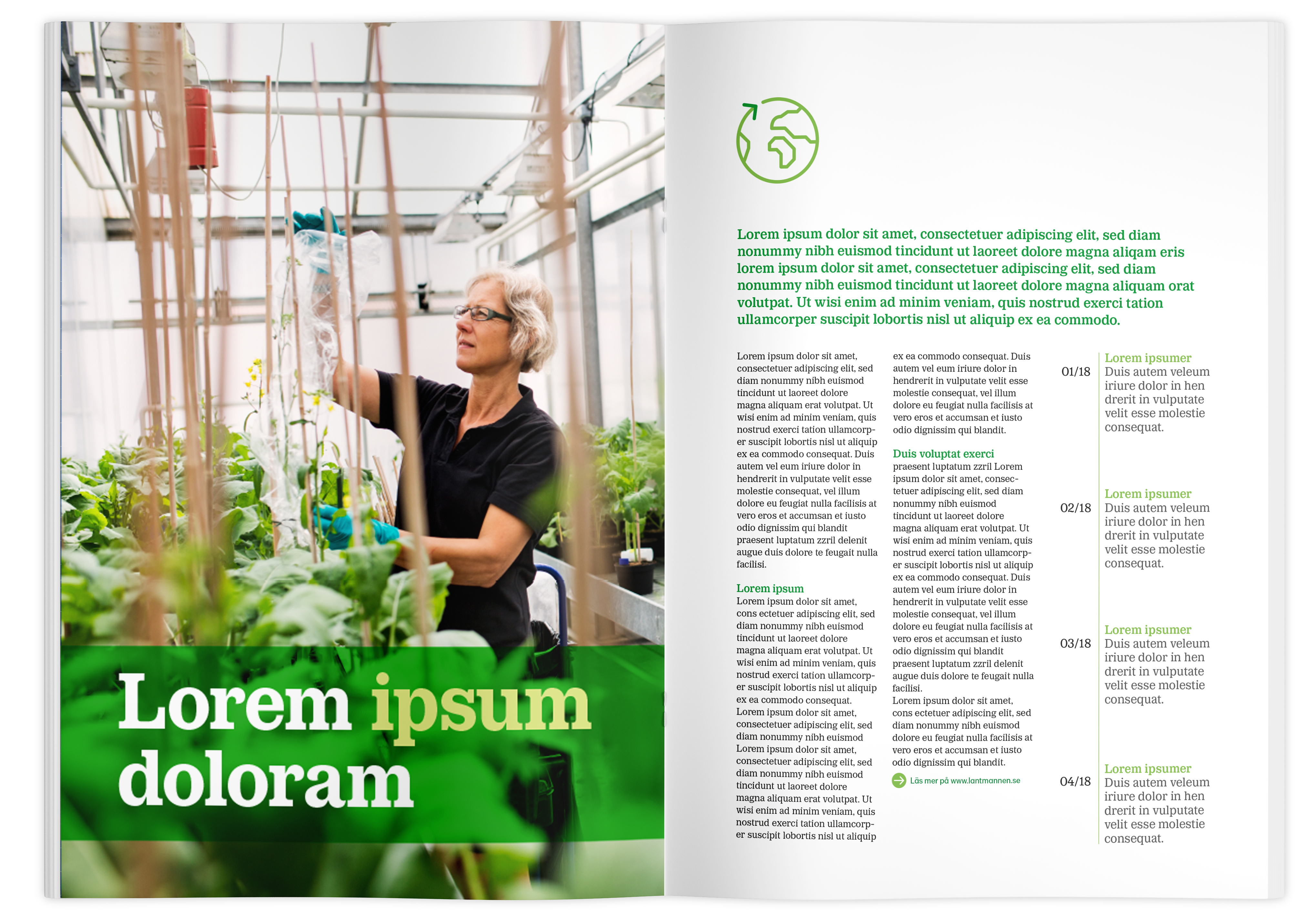
  • Here, a tone plate with transparency is used to make the title clear against a cluttered image.

  • The tone plate and pictogram mark the setting area.

Publications - image cropping

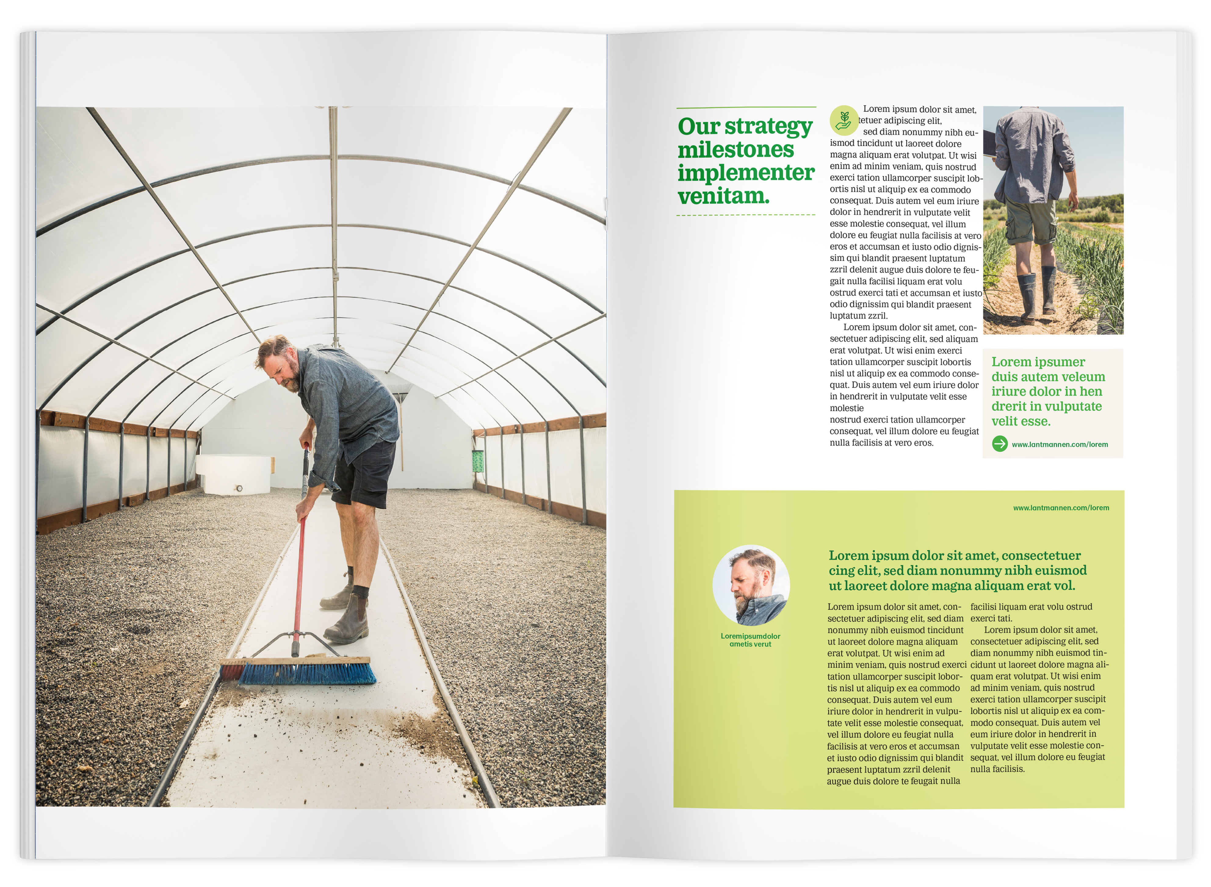
  • Here, the image on the left side is cropped so that it marks the setting area.


Publications - page division

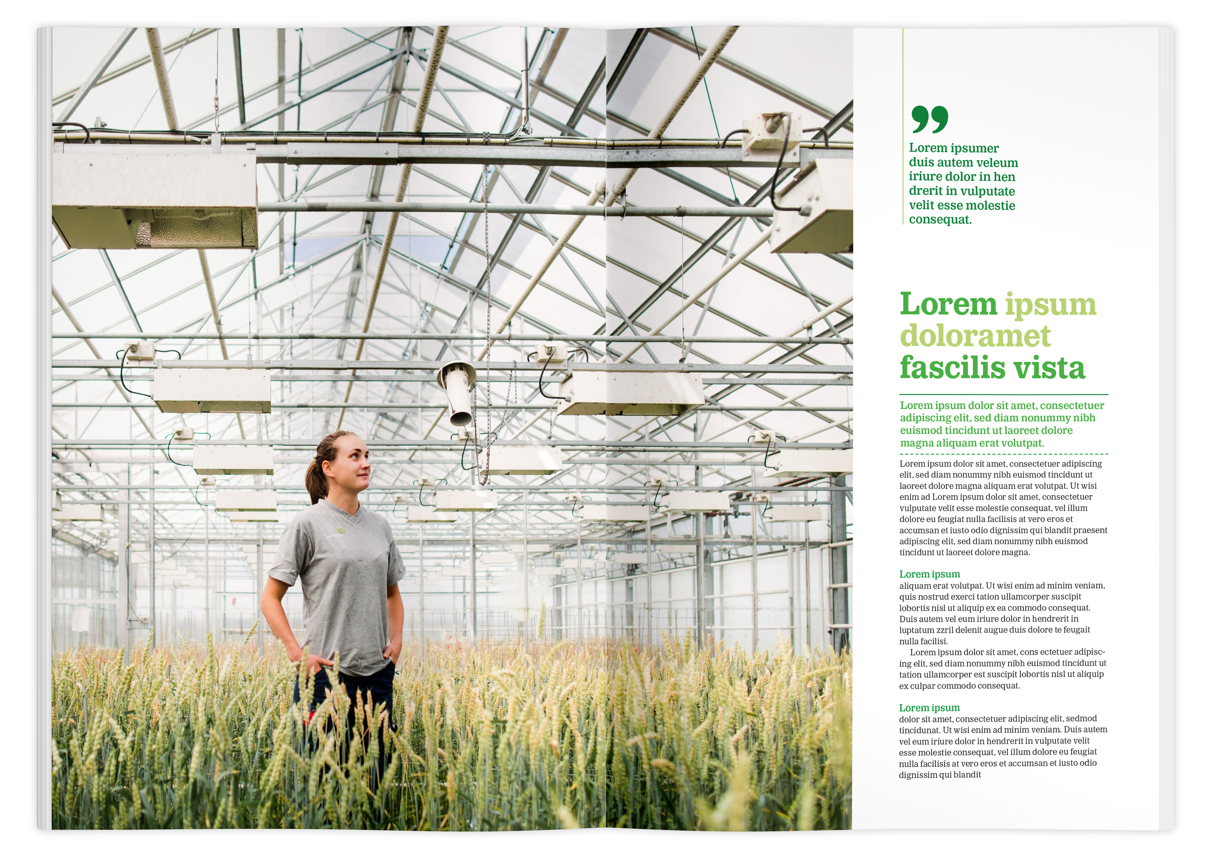
  • The page division can be broken for variation and effect.

  • The quote hangs down from the top of the page and marks the start of the column on the left edge.

Publications - infographics & color

  • The infographic placed in the image visually connects the content of the spread.

  • Use several green colors for a budding impression. Keep in mind that if the dark colors in the green palette are used on large areas, it is important to balance the layout with light areas and other green colors.