This is the core of our visual identity

Our graphic identity will convey Lantmännen as a future-oriented and innovative agricultural cooperative.

We build the visual identity around these building blocks - our symbol, our color and our font. These graphic elements are central to the brand and when we communicate Lantmännen.

With a powerful and budding design language and inspiring images, we invite the recipient to our green world. When we talk, we do it with the voice of the agricultural cooperative - proud that we can make a decisive difference for the future.


The Sprout is our foundation

Our symbol, a stylized sprout, is our strongest characteristic and sender in everything we communicate. The organic design of the sprout and shades of green form the basis for the building blocks of the visual identity.

Our logo consists of the symbol together with the text image.

Karaktärsfullt och individuellt profilypsnitt

Typography is a strong communicator for a brand and the impression of it. With its subtle details, it is a central and very strong carrier of the brand.

To strengthen our Lantmännen brand, we have developed our own and unique font, Lantmännen Serif, for headings, preambles and body texts. With their organic heels inspired by our symbol, text is often applied in shades of green to create identity and recognition. The different weights of the font add structure, flexibility and function.

Read more about how to use and details under  Typography.

Functional linear

The font family also includes a linear version for use with all other text. It is also uniquely developed and available in different weights.

It is based on Lantmännen Serif, and with high readability it is adapted for screens, smaller texts and tables.

Read more about details and handling of LM Sans under Typography.

Green is our color

Green is a natural color for us and a good signal color, for a healthy and natural company. Green should be the main color in all our communication and the color we allways should be associated with.

On a surface, green should be the color that stands out strongest and most clearly communicates with the viewer.

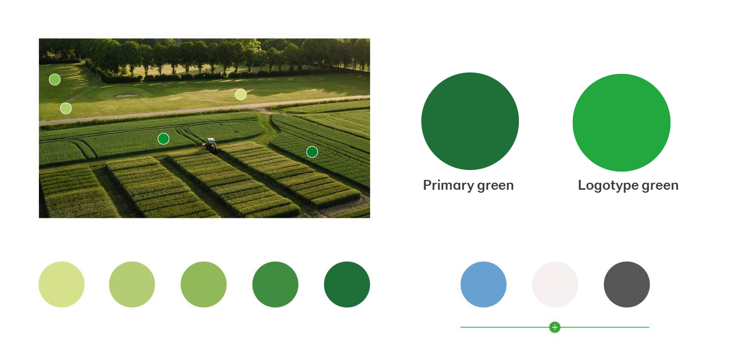
Our color scale has been taken from the shades of the fields. The soft color scale gives a natural impression and with a combination of green colors a lush whole.

Feel free to use more colors, but always start from our primary identity color and then add lighter or darker shades as needed.

Find color codes and read more about the management of our colors under the link Colors.